Please update your browser
Your current browser version is outdated. We recommend updating to the latest version for an improved and secure browsing experience.
Framing and Aspect Ratios
The Standard "Academy" Frame
From its inception at the end of the nineteenth century through the end of the silent era in the late 1920s, film had a width-to-height ratio of approximately 1.33:1. This corresponded closely to a standard human field of vision and helped to naturalize the experience of the new medium.
After the transition to sound had run its course, the Academy of Motion Picture Arts and Sciences made slight adjustments to the frame to accommodate the presence of the soundtrack and established the standard ratio as 1.37:1. This remained in use for decades and was also the standard ratio for televisions until the beginning of the twenty-first century (when a new 16:9 ratio that was also derived from cinema was selected).
The rapid adoption of television, however, led movie studios to develop a number of aspect ratio alternatives in the early 1950s.

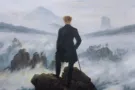
Academy Ratio Framing
Cinematographer Nicholas Musuraca made exemplary use of the standard "Academy" framing in this section of iconic film noir Out of the Past.

Abel Gance and the Triple Screen
Technology using multiple cameras and projectors to create greater breadth and a more immersive, panoramic experience had existed since the late 1920s. Most famously, Abel Gance employed three projectors and three screens at the premiere projections of his Napoléon.(1927).
Polyvision
Technical difficulties notwithstanding, Gance believed that the triple screen would serve as the “foundation for a new alphabet for the cinema.” He claimed to have had the original idea for a triple screen in 1922 and filed a patent for the technical innovations in 1926. He continued to explore and advocate for the triple screen, which he redubbed Polyvision, for the remainder of his life.
In a 1959 article published in a review associated with the conductor Hermann Scherchen’s electroacoustic sound studio in Gravesano, Switzerland, Gance even provided diagrams demonstrating how Polyvision would open up a “vast” array of possibilities for different screen combinations, one of many reasons he felt there was “hardly any comparison between this method and all existing panoramic techniques.”
Cinerama
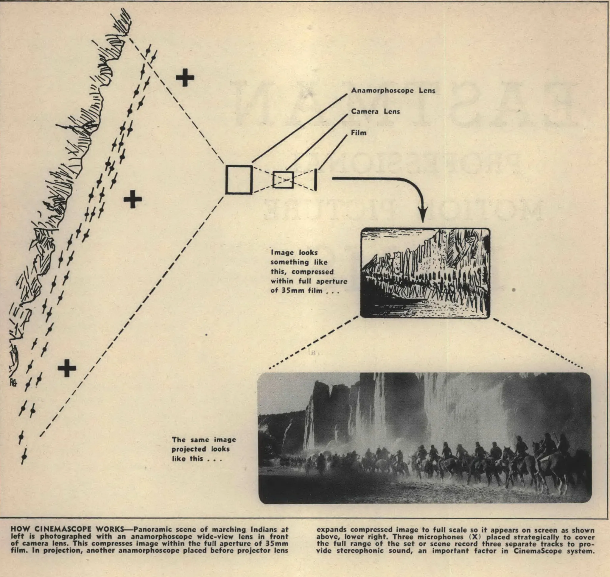
Gance’s triptychs in turn inspired Henri Chrétien to pursue a complementary approach, adapting military devices he had been developing to bring “panoramic presentations” to the screen using a single projector and an anamorphic lens called the Hypergonar. Yet since sound had just been introduced, both exhibitors and studios were understandably hesitant to adopt the new technology. No complete feature-length films were made and released with an anamorphic lens until, twenty-five years later, Twentieth Century Fox bought the rights to Chrétien’s invention and named it CinemaScope in 1953.
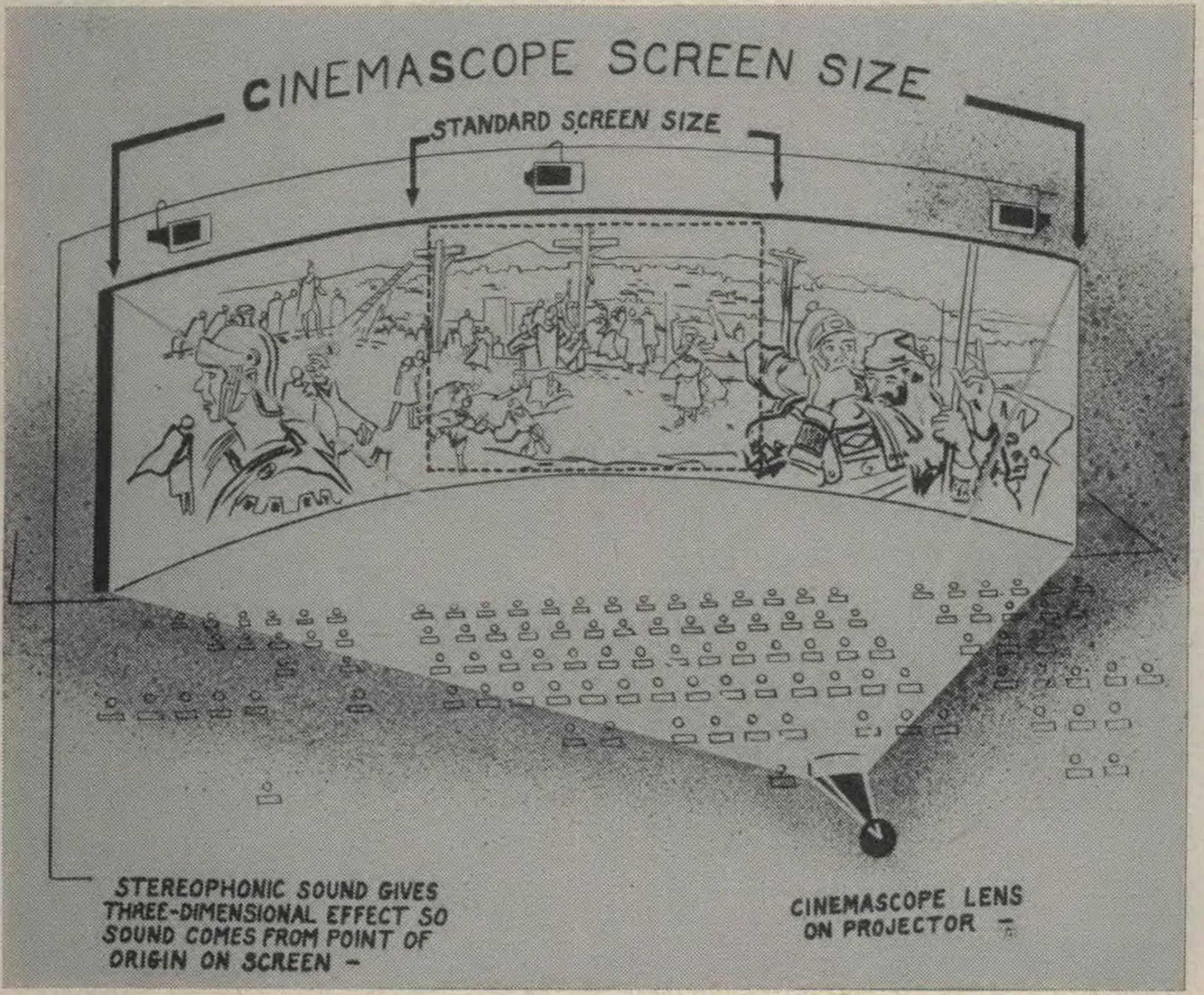
The year before, Cinerama had emerged. Much like Gance’s Napoléon presentations (but with greater technical consistency), it used synchronized projectors to combine three separate images into a composite with six times the resolution and a width-to-height ratio of approximately 2.59:1. There was one crucial difference: the images were projected on an enormous curved screen that could not possibly be taken in with a single view, which forced the spectator to constantly redirect focus across a panoramic field of vision.
Lowell Thomas, narrator and coproducer of This Is Cinerama (Merian C. Cooper, 1952), described the process as creating a “sweeping panorama in motion” and observed that the activation of peripheral vision strengthened the impression of reality.

CinemaScope
By contrast, anamorphic processes like CinemaScope used special lenses, much like the Hypergonar, to stretch images during filming and expand them during projection, producing onscreen images with a width-to-height ratio of 2.55:1 (later reduced to 2.35:1). Unlike Cinerama, CinemaScope images could be shown on existing flat screens and, since ordinary theaters needed to replace only their projectors in order to take advantage of the process, this eventually became the standard widescreen format.
Both processes were marketed as techniques facilitating more active participation on the part of the viewer, linked with a sense of presence traditionally associated with live theater and a sense of immersion associated with panoramas.

CinemaScope framing
Many veteran filmmakers, such as Charles Chaplin and Yasujirō Ozu (who famously compared the increased screen space to toilet paper), distrusted widescreen, insisting that it was useful only for spectacular, impersonal superproductions. The unbroken wide screen also opened up new compositional possibilities, however, and by the mid-1950s, directors such as Otto Preminger and Nicholas Ray had developed a rich CinemaScope aesthetic built on composition in both width and depth.
By making different sections of the frame comment upon one another, employing several interrelated circular motifs, and connecting the act of looking in both background and foreground to the movement of the camera, Preminger demonstrates the expressive possibilities of CinemaScope in this extract from River of No Return (1954).
Alternative Ratios
Since the use of CinemaScope required anamorphic lenses for production and shooting, with some associated issues in focus along the edges, many production studios adopted one of two “fake” widescreen formats. These did not require any special cameras or anamorphosis, and simply involved cropping part of the full frame image, often with a plate in the projector, and then magnifying the rest with an appropriately sized lens. In America in the mid-1950s and in Europe for several decades, the standard was a 1.66:1 width-to-height ratio. In America from the late 1950s and in many parts of Asia, a 1.85:1 width-to-height ratio was more common. Over time, 1.85:1 become the standard, non-anamorphic film ratio and, from 2004, this was also used as the basis for the 16:9 High Definition Television Ratio.
With digital cameras, it is easier to select any of these ratios and Darius Khondji has worked with almost all of them. He has exhibited particular virtuosity with CinemaScope framing, which presents a range of framing challenges, but gives even ordinary scenes a sense of scale.

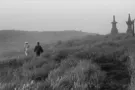
1.66:1 Framing
Ingmar Bergman and cinematographer Sven Nykvist made exceptional use of the 1.66:1 ratio to create heightened intimacy by emphasizing the space around faces.

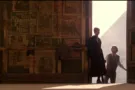
1.85:1 Framing
Martin Scorsese and cinematographer Michael Chapman made exemplary use of the increased lateral space of 1.85:1 framing in this section of Taxi Driver (as Darius Khondji did in the extracts below).
For Delicatessen, director Jean-Pierre Jeunet and co-director Marc Caro prepared storyboards and then Jeunet "photoboarded" individual shots, mapping out precise compositions and focal lengths. Khondji's responsibility was for the lighting, grading, and overall tonality of the images (including the choice to employ particular film stocks and to flash the negative to shift the colors).

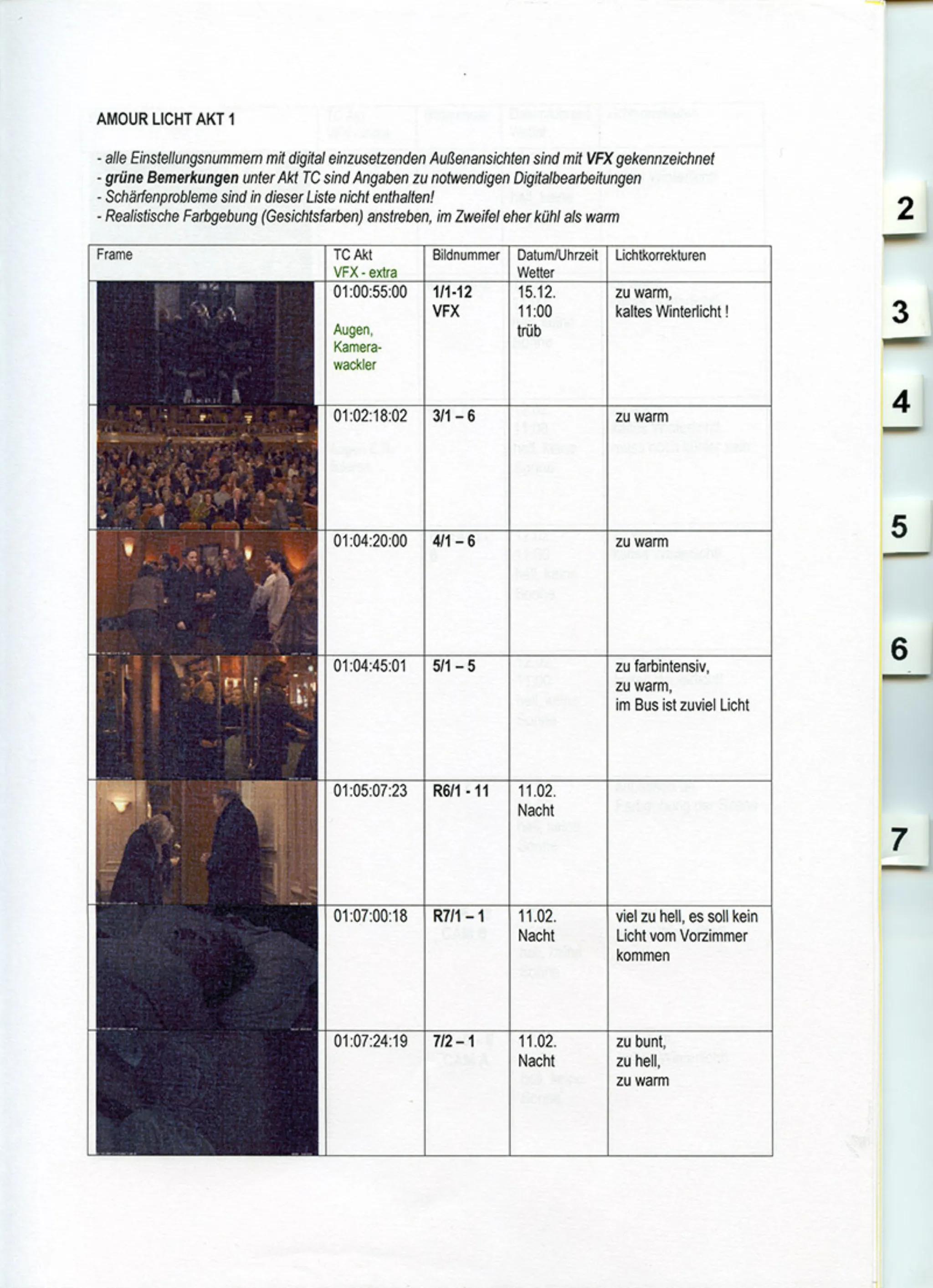
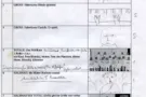
Michael Haneke's Grading for Amour (2012)
In this document, director Michael Haneke demonstrates the care and precision that go into all aspects of composition by providing detailed instructions on the light calibration and color grading in the sequence above.
Translation of Michael Haneke's notes at the top:
- All setting numbers with external views to be used digitally are marked with VFX. Green comments under Act TC are warnings about necessary digital editing.
- Sharpness problems are not included in this listing!
- Aim for realistic coloring (colors of faces); if in doubt, cool rather than warm
Comments about the initial grading of the scene above [changes were made for the finished film]:
- Too colorful
- Too warm
- There is too much light on the bus


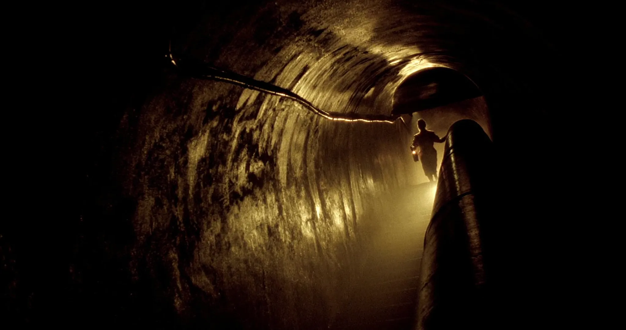
Khondji's CinemaScope (2.35:1) Framing
Eloquent CinemaScope framing requires a very different positioning of figures in relation to environments that almost inevitably seem overwhelming. James Gray and Darius Khondji complement these effects through stark chiaroscuro and highly localized light sources in this extract from The Lost City of Z (2017).
-
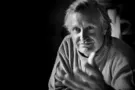
John Boorman
